
Sunday 30 October 2011
Book Cover Design - Final Statement Of Intent
THE TALE:
After much deliberation and ideas bouncing back and forth I have finally settled on my idea and process of my book cover design.
Below are images of the clothing and props to be used for the shoot:
Red Riding Hood by the Brothers Grimm
After much deliberation and ideas bouncing back and forth I have finally settled on my idea and process of my book cover design.
I am still going to do an interpretation of Red Riding Hood by the brothers Grimm however instead of red riding hoodie, I have decided to go back nearly 70 years to ze war! Inspired by watching Inglorious Basterds again and for the current fashion interest in 40's style retro chic I have decided to change red riding hood to a 40's style French femme fatale spy. She now becomes 'Petit Chaperon Rouge'. The wolf of the story will be a German agent.
THE SHOOT:
On location, Hebden Bridge
The shoot will take place on location outside underneath the railway bridge close to where I live. This will give it a spy’s rendezvous feel. The railway bridge is old so can easily pass for architecture of that period. I have sourced a model that will wear a 40's style long mac and will be smoking a cigarette through a cigarette holder. The model has red hair so that will be the 'rouge'. I also have a model ready to step into the boots of the wolf. I will shoot it before Christmas and the winter weather will give it a dark, wet and grimy feel. The colours will be that of old stone and bare trees or I may black & white the image but use selective colouring so the models hair is still red. I have purchased a toy gun already which has the look of a WWII style gun.
I will also shoot a different image for the back cover. This will be of red riding hoods hands opening up a case with the wolf's head in it. This will be a close up image and will be the basis of the back cover. Ths image will be shot indoors in a studio and I will use lighting just to light the case itself with red riding hood in the background in shadow. She will be wearing red leather gloves as she opens the case.
I hope the finished book cover will give anyone looking at it a interesting and different take on the famous fairy tale. I hope it will be a stylised image with great detail given to the whole composition, with the location, make up, props and clothes worn by the models totally encapsulating a 1940's feel.
 |
| 40's style mac |
 |
| gun |
Monday 10 October 2011
Book Cover Design - reflection
After much contemplation and some experimentation I have decided on my image for the book cover project.
First of all I will be using Red Riding Hood (by the brothers Grimm) as my inspiration but I shall be giving her a little dark urban twist. Red Riding Hood shall be come 'Red Riding Hoodie'.Some credit in part must go to Roald Dahl's Revolting Rymes and his Red Riding Hood incarnation "The small girl smiles/Her eyelid flickers/She whips a pistol from her knickers", which has obviously stayed in my subconcious since circa 1984!
I had initially decided to shoot on location at a location that comprised of both woodland scenery and some urban decay. I found an area near by to my home which encapsulated both perfectly. An area surrounded by trees and foliage which is also home to a graffiti tagged rusty old metal container (see fig 1 below).
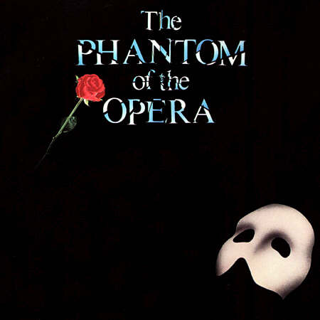
However after reviewing my images from a short photoshoot I did and deciding that I wanted to go down a different path and create an image that was more simple yet just as effewctive in what I want to achieve and what I want the cover to represent. Although not as simple as the design for The Phantom Of The Opera (see fig 2) the image I want to create will be more direct and less cluttered than the original idea. I also wanted to make sure the typography had its own space in which to breathe and was not lost in a over complicated background or squashed into such a tiny space it looked like an afterthought.
So how am I going to achieve my image?
I want to shoot a close up portrait style picture of my Red Riding Hoodie which although closely cropped will still contain all the iconic elements of Red Riding Hood i.e. red hood & axe. I shall shoot my image in the college studio using a female model shot against a black backdrop (in order to give the red hood more vibrancy and for mood and dark tone). I have already been in touch with a model and all that remains is too confirm a date and book a slot in the studio. I am aiming for an end of october/beginning of november shoot.
I hope to achieve an image similar in style to a poster for a film called 'Heartless ' which was released in 2010. Fig 3 shows said film poster.
The positing of the text for the front cover will be set out very similar to fig 3 and will give the cover a movie poster like feel to it. I like the way the text is below the image very much like a mug shot or corporate photo you see when entering a builidng of a large organisation.
Setting out the text this way frames the photo nicely and once again gives it that whole feel of a cult film character. If only to reiterate this please see below for other examples and inspiration.
First of all I will be using Red Riding Hood (by the brothers Grimm) as my inspiration but I shall be giving her a little dark urban twist. Red Riding Hood shall be come 'Red Riding Hoodie'.Some credit in part must go to Roald Dahl's Revolting Rymes and his Red Riding Hood incarnation "The small girl smiles/Her eyelid flickers/She whips a pistol from her knickers", which has obviously stayed in my subconcious since circa 1984!
I had initially decided to shoot on location at a location that comprised of both woodland scenery and some urban decay. I found an area near by to my home which encapsulated both perfectly. An area surrounded by trees and foliage which is also home to a graffiti tagged rusty old metal container (see fig 1 below).
 | ||
| (fig 1) |
 | |||
| (fig 2) |
I want to shoot a close up portrait style picture of my Red Riding Hoodie which although closely cropped will still contain all the iconic elements of Red Riding Hood i.e. red hood & axe. I shall shoot my image in the college studio using a female model shot against a black backdrop (in order to give the red hood more vibrancy and for mood and dark tone). I have already been in touch with a model and all that remains is too confirm a date and book a slot in the studio. I am aiming for an end of october/beginning of november shoot.
I hope to achieve an image similar in style to a poster for a film called 'Heartless ' which was released in 2010. Fig 3 shows said film poster.
 | ||||||||
| (fig 3) |
Setting out the text this way frames the photo nicely and once again gives it that whole feel of a cult film character. If only to reiterate this please see below for other examples and inspiration.
 |
| fig 4 |
 |
| fig 5 |
 |
| fig 6 |
 |
| fig 7 |
Sunday 9 October 2011
Portrait or Landscape...that is the question
Ok, lets get this straight from the start. This Blog is about standrad book sizes. Thats it. Or is it?
Is there more than meets the eye? Well if I was going to publish my Red Riding Hoodie then yes there is. It seems that if my book was printed in the standard A size ( 175 x 111 mm) then it is doomed to be stuck underneath dirge by Jeffrey Archer and Katie Price in a basket in Asda. Snobbish? Yes probably. But ask yourself this - will your book be given the attention it deserves inbetween the birthday cards and the frozen fish aisle? I think not. If I was creating a book to be published and I was taking it as seriously as I am taking designing ther cover then I would want it to be positioned next to the best selling fairytales in the fiction section of Waterstones. Or if I had my way the cover itself would be such a fantastic piece of photographic art and design it would place itself quite proudly next to Gregory Crewdson's magnificant landscape sized wonders! I digress.
What size should I choose for my book cover? Below are the standard sizes for books:
(table courtesy of http://www.writersservices.com/wps/s1_book_sizes.htm)
Size B it seems is the standard hardback size. I had a look through my bookshelf and narrowed it down to two sizes and shapes.
 I thought about the landscape size and thought how wonderful it would be to create such a wide panoramic style book cover. Like a scene from my very own Red Riding Hoodie movie. And then I thought about it again. In order to create such a photograph I am going to have to make sure every part of the image is in great detail. Something my Canon 450D I don't think can handle. I could hire a camera maybe? But no - I have decided on using the portrait syle book cover. My statement of intent (blog to follow) will describe in more detail about the image and typography and how I am hoping to achieve on it.

Is there more than meets the eye? Well if I was going to publish my Red Riding Hoodie then yes there is. It seems that if my book was printed in the standard A size ( 175 x 111 mm) then it is doomed to be stuck underneath dirge by Jeffrey Archer and Katie Price in a basket in Asda. Snobbish? Yes probably. But ask yourself this - will your book be given the attention it deserves inbetween the birthday cards and the frozen fish aisle? I think not. If I was creating a book to be published and I was taking it as seriously as I am taking designing ther cover then I would want it to be positioned next to the best selling fairytales in the fiction section of Waterstones. Or if I had my way the cover itself would be such a fantastic piece of photographic art and design it would place itself quite proudly next to Gregory Crewdson's magnificant landscape sized wonders! I digress.
What size should I choose for my book cover? Below are the standard sizes for books:
| Name | Imperial (inches approx) | Metric (mm) |
| Demy | 9 x 6 | 229 x 152 |
| Royal | 9 1/4 x 7 1/2 | 235 x 191 |
| Crown Royal | 11 x 8 1/4 | 280 x 210 |
| Classic hardback or C format paperback | 8 3/4 x 5 5/8 | 222 x 143 |
| 'Trade' paperback or B format | 8 x 5 1/4 | 198 x 129 |
| A format | 6 7/8 x 4 1/4 | 175 x 111 |
Size B it seems is the standard hardback size. I had a look through my bookshelf and narrowed it down to two sizes and shapes.


QR Code
Just created a QR code for my book cover design when finished. This will take all those who scan it straight to this blog. So if your already here....don't bother!
Isn't technology amazing!!!

<img src="http://qrcode.kaywa.com/img.php?s=6&d=http%3A%2F%2Fsamjphotography.blogspot.com%2F" alt="qrcode" />
Isn't technology amazing!!!

<img src="http://qrcode.kaywa.com/img.php?s=6&d=http%3A%2F%2Fsamjphotography.blogspot.com%2F" alt="qrcode" />
Monday 3 October 2011
Does it work? Or doesn't it? Hmmmm
Now having played around with one of the images I shot I have come up with the image below.


This my first attempt. I then thought I would have a go at adding some text and seeing how I could lay the text round the image. Thus I came up with the following image.

I opened up the image in Photoshop Elements and played around with the colours. I took down the greens and yellows to make the image look like it was taken at night and not in the bright midday sun. I like the typography on the image however I don't like Nikki's right hand. She has a gold knuckle duster ring on, which I like, but it looks like she was giving me a two finger salute (which she wasn't) and I have chopped her fingers off. Also the image doesn't really have the 'exploitation' feel I was hoping to give the cover. It does have a feel to it of the GHD advert below. I am contemplating asking Nikki to come back and model again when we will have more time and I can take my time with the shots and work on the details and composition.
 | |
| (Fig1. GHD Twisted Fairytales Marketing Campaign, | photo by Tim Brett Day 2009) |
Book cover photoshoot
So I decided to use Red Riding Hood as my inspiration for my mock book cover module at University. Being a fan of old 70's style exploitation films (Foxy Brown, Coffy etc, etc) I have decided I want to give my book cover that sort of feel to it - as such Red Riding Hood will become - Red Riding Hoodie! David Cameron can try and hug her if he wants.....but I don't recommend it! Hang on, that could be the tag line......
 I managed to convince a friend to model for me who has modelled before and she is easy to work with. We both came up with ideas for the outfit and settled on a more contemporary look for red riding hoodie. I decided to shoot at an outside location near to me - some wasteland with a lots of trees surrounding it. Perfect!
The shoot was all set for Saturday the 1 st October at 11 a.m. Due to transport problems Nikki was over an hour late meaning we only had 30 minutes to do a shoot before her lift had to set off back! Not ideal.....
The shoot as you can imagine was rushed. I think I got some ok shots in the time given but I will have a good look through all of them (which wont take long!) and see if any are going to be suitable.
Subscribe to:
Posts (Atom)